Flexbox : Creating Flexible Layouts in CSS


Introduction : Layout Design with Flexbox
In the dynamic world of web design, crafting layouts that seamlessly adapt to various screen sizes has been a perpetual challenge. Enter Flexbox a game-changing layout model in CSS that revolutionizes the way we create responsive designs.
Flexbox, short for Flexible Box, offers a powerful set of CSS properties specifically designed to simplify the creation of complex and adaptable layouts. Its versatility allows designers and developers to effortlessly organize content within containers, enabling fluid and intuitive designs that gracefully adjust to different devices and screen resolutions.
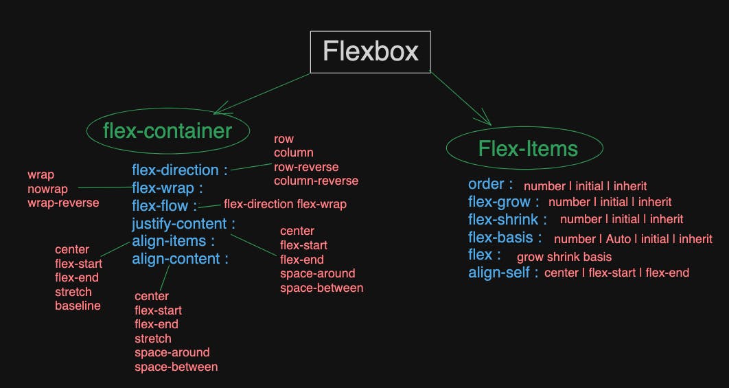
Overview : FlexBox Properties & It's Values
How to apply Flex into CSS code ?
To add Flexbox to code, follow these steps:
Step 1: Set up a Container
Firstly, identify the container element in your HTML that you want to transform into a flex container. It could be a <div>, <section>, or any other element.
<div class="flex-container">
  <!-- Your flex items go here -->
  <div class="flex-item">Item 1</div>
  <div class="flex-item">Item 2</div>
  <div class="flex-item">Item 3</div>
</div>
Step 2: Apply Flexbox Properties in CSS
In your CSS file or within <style> tags in your HTML file, target the flex container using its class or ID and apply the display: flex property.
/* Apply Flexbox to the container */
.flex-container {
  display: flex;
}
Step 3: Customize Flexbox Properties
Utilize various Flexbox properties to control the layout, alignment, and behavior of flex items within the container.
For example, to align items horizontally and justify them to the center:
/* Customize Flexbox properties */
.flex-container {
  display: flex;
  justify-content: center; /* Align items horizontally */
  align-items: center; /* Align items vertically */
}
Step 4: Define Flex Items
Style your flex items as needed. Flex items inherit the flex container's properties unless specified otherwise.
/* Style flex items */
.flex-item {
  /* Additional styling for your flex items */
  margin: 10px; /* Example margin */
}
Examples :
1. display: flex; - Establishes a flex container
<style>
  .flex-container {
    display: flex;
    border: 1px solid #333; /* Just for visualization */
  }
  .flex-item {
    padding: 10px;
    margin: 5px;
    background-color: #f0f0f0;
  }
</style>

<div class="flex-container">
  <div class="flex-item">Item 1</div>
  <div class="flex-item">Item 2</div>
  <div class="flex-item">Item 3</div>
</div>
2. flex-direction: row; - Arranges items in a row (default)
<style>
  .flex-container {
    display: flex;
    flex-direction: row;
  }
  /* Other styles as in the previous example */
</style>

<div class="flex-container">
  <div class="flex-item">Item 1</div>
  <div class="flex-item">Item 2</div>
  <div class="flex-item">Item 3</div>
</div>
3. flex-wrap: wrap; - Flex items wrap onto multiple lines if needed
<style>
  .flex-container {
    display: flex;
    flex-wrap: wrap;
    /* flex-direction: row; by default */
  }
  /* Other styles as in the first example */
</style>

<div class="flex-container">
  <div class="flex-item">Item 1</div>
  <div class="flex-item">Item 2</div>
  <div class="flex-item">Item 3</div>
  <!-- Adding more items to show wrapping -->
  <div class="flex-item">Item 4</div>
  <div class="flex-item">Item 5</div>
  <div class="flex-item">Item 6</div>
</div>
4. justify-content: center; - Centers items along the main axis
<style>
  .flex-container {
    display: flex;
    justify-content: center;
    /* flex-direction: row; by default */
    /* flex-wrap: nowrap; by default */
  }
  /* Other styles as in the first example */
</style>

<div class="flex-container">
  <div class="flex-item">Item 1</div>
  <div class="flex-item">Item 2</div>
  <div class="flex-item">Item 3</div>
</div>
5. align-items: center; - Centers items on the cross axis
<style>
  .flex-container {
    display: flex;
    align-items: center;
    /* flex-direction: row; by default */
    /* flex-wrap: nowrap; by default */
    /* justify-content: flex-start; by default */
  }
  /* Other styles as in the first example */
</style>

<div class="flex-container" style="height: 200px;"> <!-- Added height for visualization -->
  <div class="flex-item">Item 1</div>
  <div class="flex-item">Item 2</div>
  <div class="flex-item">Item 3</div>
</div>
6. align-content: space-around; - Distributes content evenly with space around them
<style>
  .flex-container {
    display: flex;
    flex-wrap: wrap;
    align-content: space-around;
    /* flex-direction: row; by default */
    /* justify-content: flex-start; by default */
  }
  /* Other styles as in the third example */
</style>

<div class="flex-container" style="height: 200px;"> <!-- Added height for visualization -->
  <div class="flex-item">Item 1</div>
  <div class="flex-item">Item 2</div>
  <div class="flex-item">Item 3</div>
  <div class="flex-item">Item 4</div>
  <div class="flex-item">Item 5</div>
</div>
Flex-items Examples :
Certainly! Here's an example for each Flexbox property applicable to flex items within a flex container:
1. flex-grow: 1; - Allows items to grow within the container
<style>
  .flex-container {
    display: flex;
    /* Other container styles as needed */
  }
  .flex-item {
    flex-grow: 1;
    /* Other styles for flex items */
  }
</style>

<div class="flex-container">
  <div class="flex-item">Item 1</div>
  <div class="flex-item">Item 2</div>
  <div class="flex-item">Item 3</div>
</div>
2. flex-shrink: 0; - Prevents items from shrinking within the container
<style>
  .flex-container {
    display: flex;
    /* Other container styles as needed */
  }
  .flex-item {
    flex-shrink: 0;
    /* Other styles for flex items */
  }
</style>

<div class="flex-container">
  <div class="flex-item">Item 1</div>
  <div class="flex-item">Item 2</div>
  <div class="flex-item">Item 3</div>
</div>
3. flex-basis: 100px; - Sets the initial size of the item
<style>
  .flex-container {
    display: flex;
    /* Other container styles as needed */
  }
  .flex-item {
    flex-basis: 100px;
    /* Other styles for flex items */
  }
</style>

<div class="flex-container">
  <div class="flex-item">Item 1</div>
  <div class="flex-item">Item 2</div>
  <div class="flex-item">Item 3</div>
</div>
4. align-self: flex-end; - Overrides the container's alignment for a specific item
<style>
  .flex-container {
    display: flex;
    align-items: center; /* Default alignment */
    /* Other container styles as needed */
  }
  .flex-item {
    align-self: flex-end;
    /* Other styles for flex items */
  }
</style>

<div class="flex-container">
  <div class="flex-item">Item 1</div>
  <div class="flex-item">Item 2</div>
  <div class="flex-item">Item 3</div>
</div>
5. order: 2; - Specifies the order of a flex item
<style>
  .flex-container {
    display: flex;
    /* Other container styles as needed */
  }
  .flex-item {
    /* Other styles for flex items */
  }
  .item-1 { order: 3; }
  .item-2 { order: 1; }
  .item-3 { order: 2; }
</style>

<div class="flex-container">
  <div class="flex-item item-1">Item 1</div>
  <div class="flex-item item-2">Item 2</div>
  <div class="flex-item item-3">Item 3</div>
</div>
These properties enable control over layout direction, wrapping behavior, alignment, and spacing within the flex container, providing immense flexibility and control in designing responsive and dynamic layouts.